Maria Lynam
Graphic Design BA(Hons)
Mossgiel's story is unique, just like their milk. Its heritage is part of their ongoing journey to change the future of agriculture and resorting to how dairy used to be 30 years ago, with cream at the top.
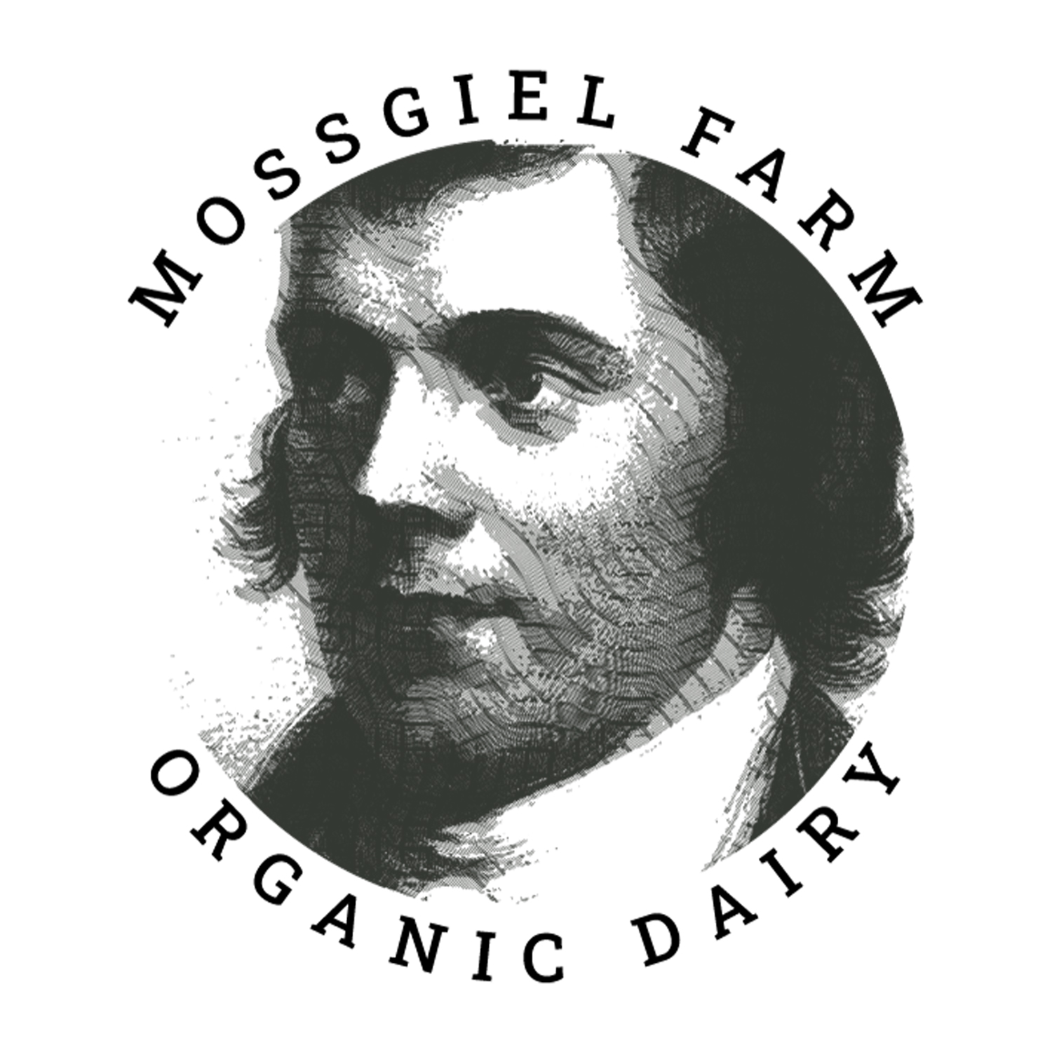
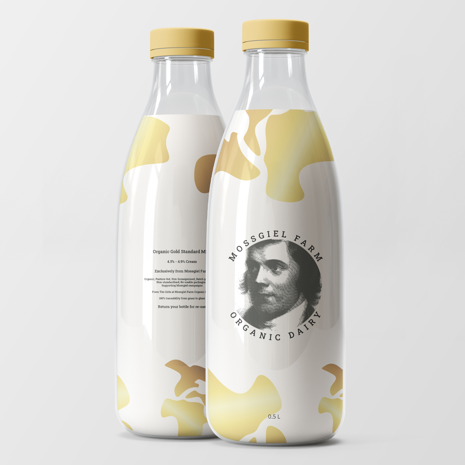
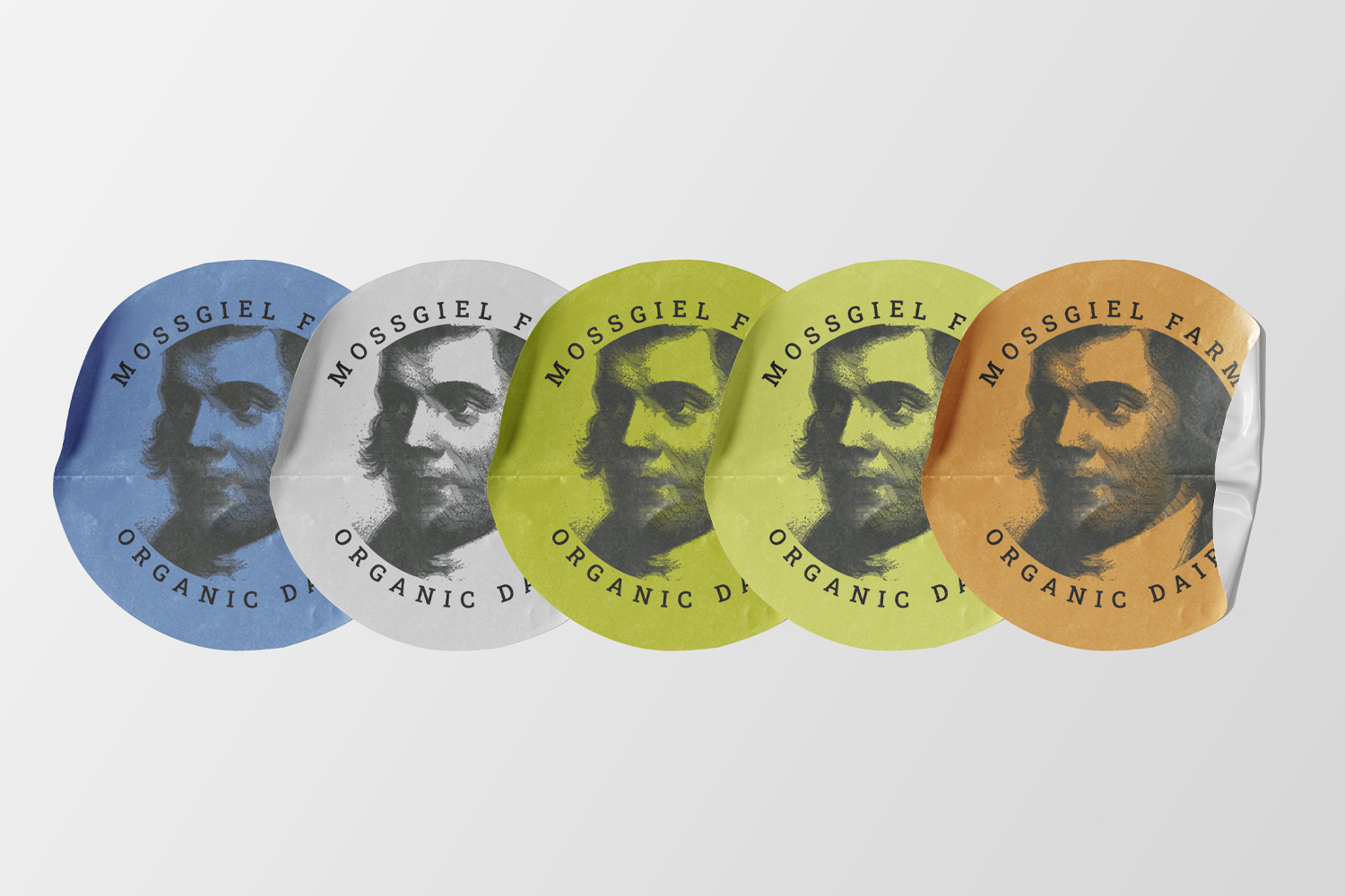
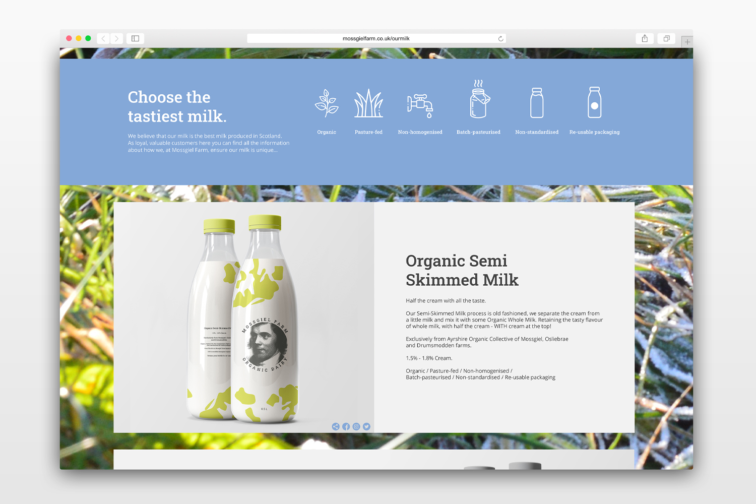
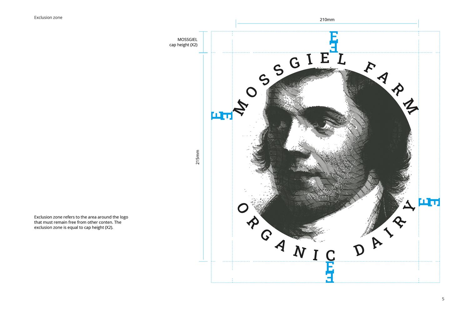
The multi-award-winning Mossgiel Farm Organic Dairy required a re-brand that focused on its authenticity and heritage. Connecting with audiences and building brand awareness to encourage a change for organic, sustainable farming. A bright, new colour scheme reflects the fresh, natural appeal of the Mossgiel produce, understanding where it comes from and how it’s made. Robert Burns takes centre stage on the logo, to show the progressive history from over 150 years at Mossgiel. New product packaging shows 'The Girls' patterns on each bottle, individually representing the milk type and cream percentage.
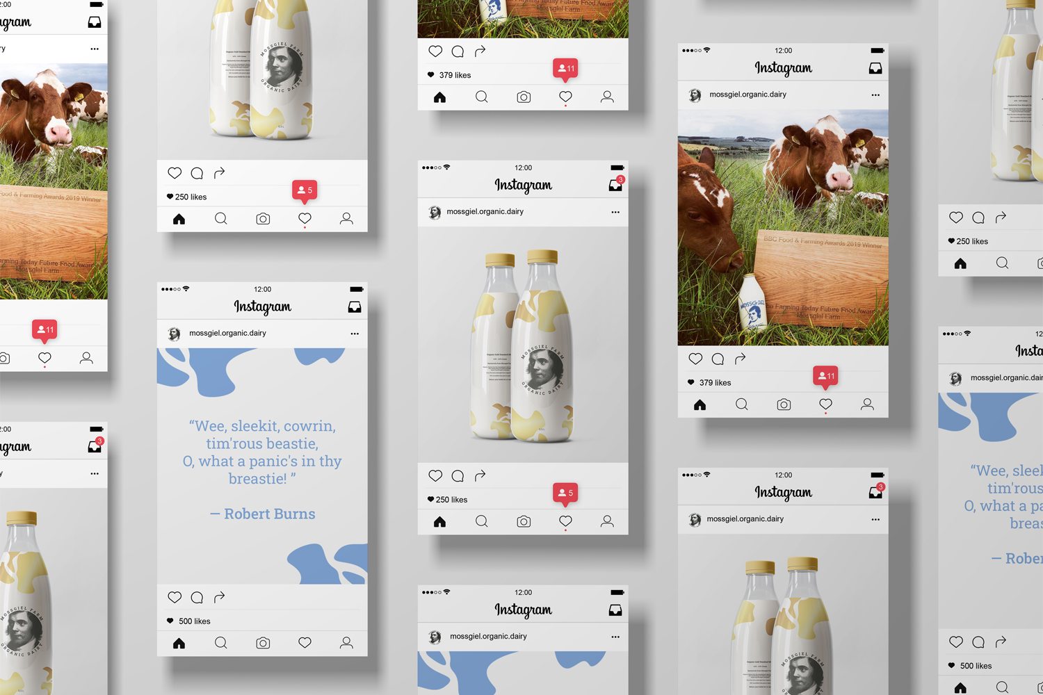
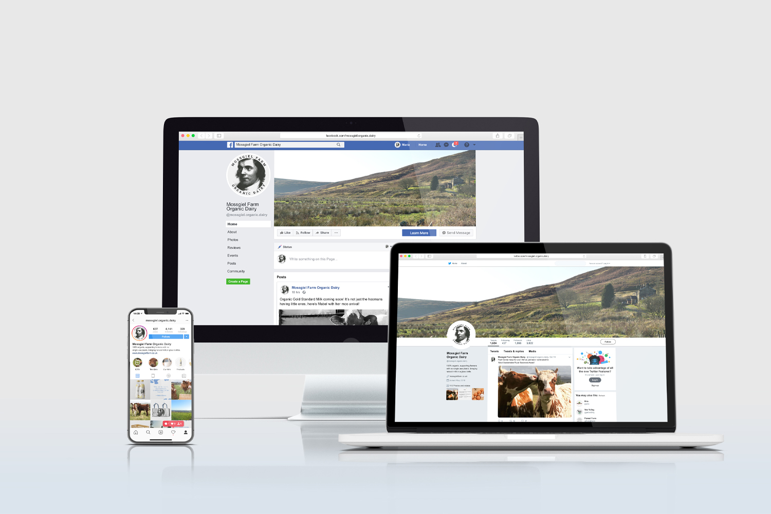
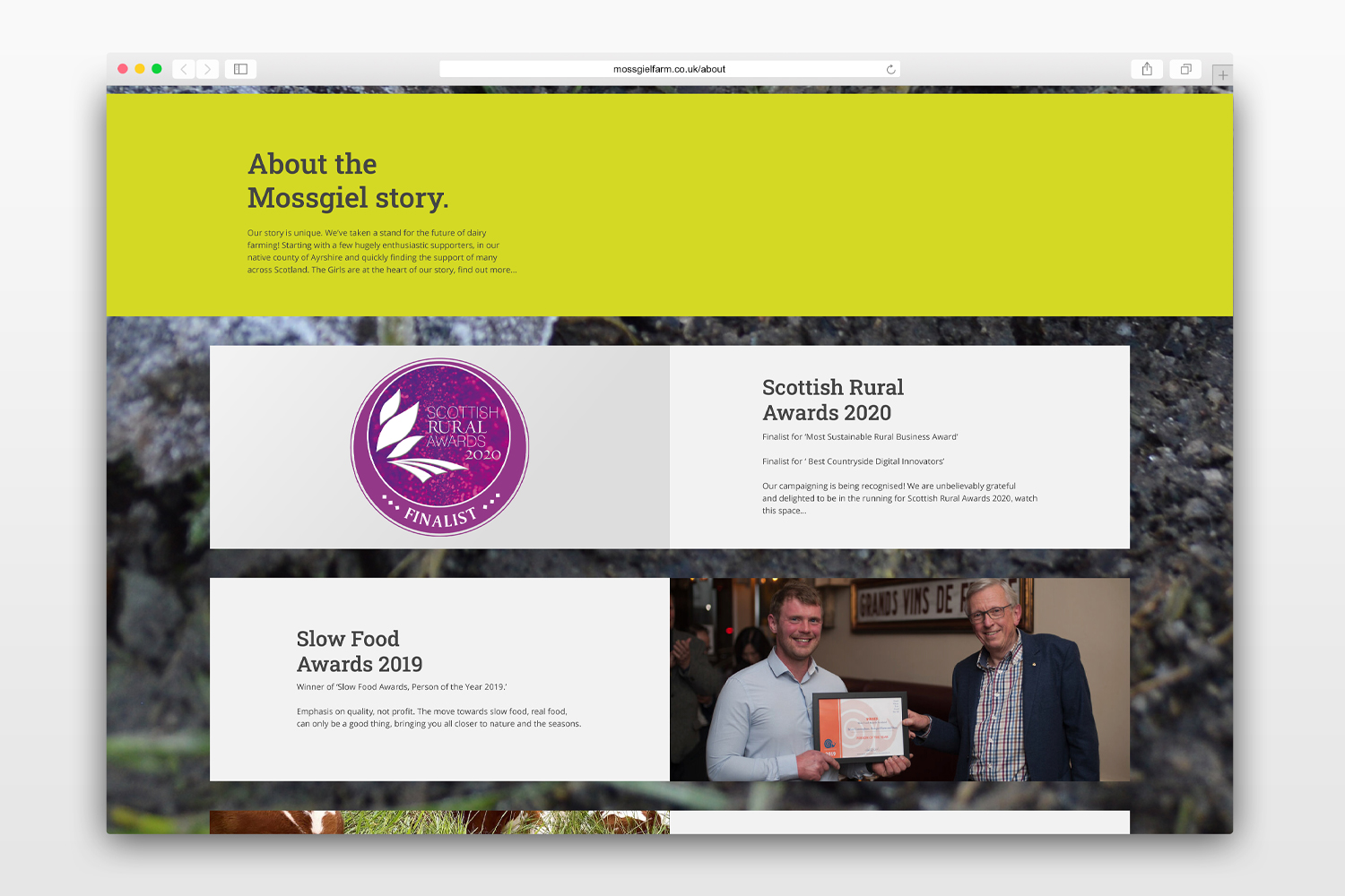
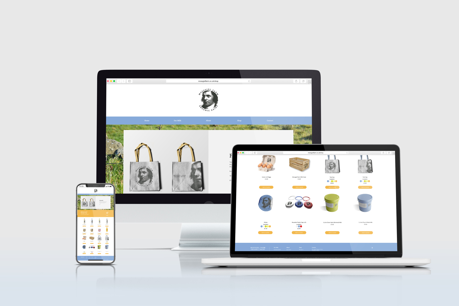
These assets of the Mossgiel brand are brought together on an informative and educational website that considers layout, consistency, and relevant photography. The brand identity and style guide introduce the brand and ensure unity across digital and print material. Tailoring social media posts on each platform to target multiple audiences from generations of heritage at Mossgiel assures the development of its awareness and brand personality.